
The Universal Language of the Grid
Look closely at any global wardrobe, and you will find a grid. From the lightweight summer shirts on the streets of Milan to the sharp corporate tailoring of London, the check pattern is everywhere. It is, without a doubt, the universal language of textiles.
But this brings us to The Paradox of Checks: how did a design so completely rigid and geometric become the ultimate symbol of personal expression? A check is nothing more than strict mathematics – straight lines crossing at perfect 90-degree angles. There are no organic curves, no freehand drawings, and no fluid shapes. Yet, for centuries, humanity has used this exact graphic cage to break rules, spark revolutions, and signal elite status.
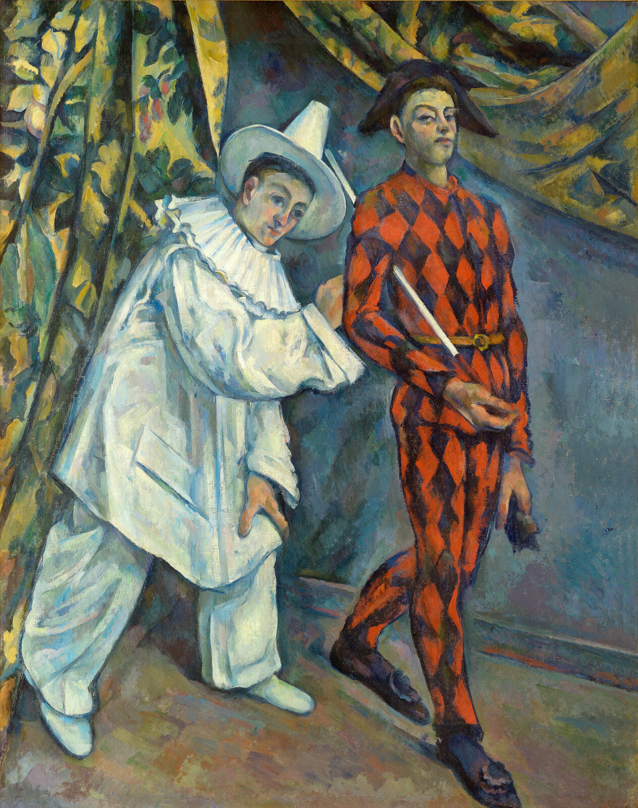
Paul Cézanne ‘Pierrot and Harlequin’.
The secret is that the check wasn’t invented by an artist staring at a blank canvas. It was forced into existence by the sheer mechanics of the loom. Before we could easily print graphics onto cloth, the only way to create a pattern was to change the color of the yarn itself. The grid was a technical limitation. And it is precisely how weavers turned this machine restriction into a global cultural code that makes the history of checks so fascinating.
So, forget everything you knew about standard wardrobe basics. In the paragraphs below, we are stripping the check pattern down to its bare threads. We will explore how it split into three distinct technical families: from the lightweight, sun-drenched cottons of Gingham and Madras, through the sharp architectural lines of Windowpane and the rebellious bloodlines of Scottish Tartan, and the Prince of Wales. Welcome to the secret physics and wild cultural history of the grid.
How a Check Pattern is Born
Before we dive into the wild stories, let’s get some terminology out of the way and look at the actual mechanics. In the textile industry, a check is never a surface print. It is pure mathematics, hardwired into the fabric during the weaving process. From a technical standpoint, a loom operates like the world’s earliest binary computer, driven by the intersection of two distinct thread systems.
First, you have the Warp — the vertical yarns tensioned tightly along the loom. Then, enters the Weft — the horizontal yarn loaded into the shuttle. The shuttle essentially pierces through the warp field, flying left to right and carrying the horizontal thread behind it.
To make this process generate sharp geometry instead of a monochrome solid, the mill technician must program a specific pattern repeat (sett). If you map out the warp with contrasting colored stripes but fail to match that exact sequence with the horizontal weft passes, you end up with basic, boring vertical stripes instead of a check. Total rookie mistake.
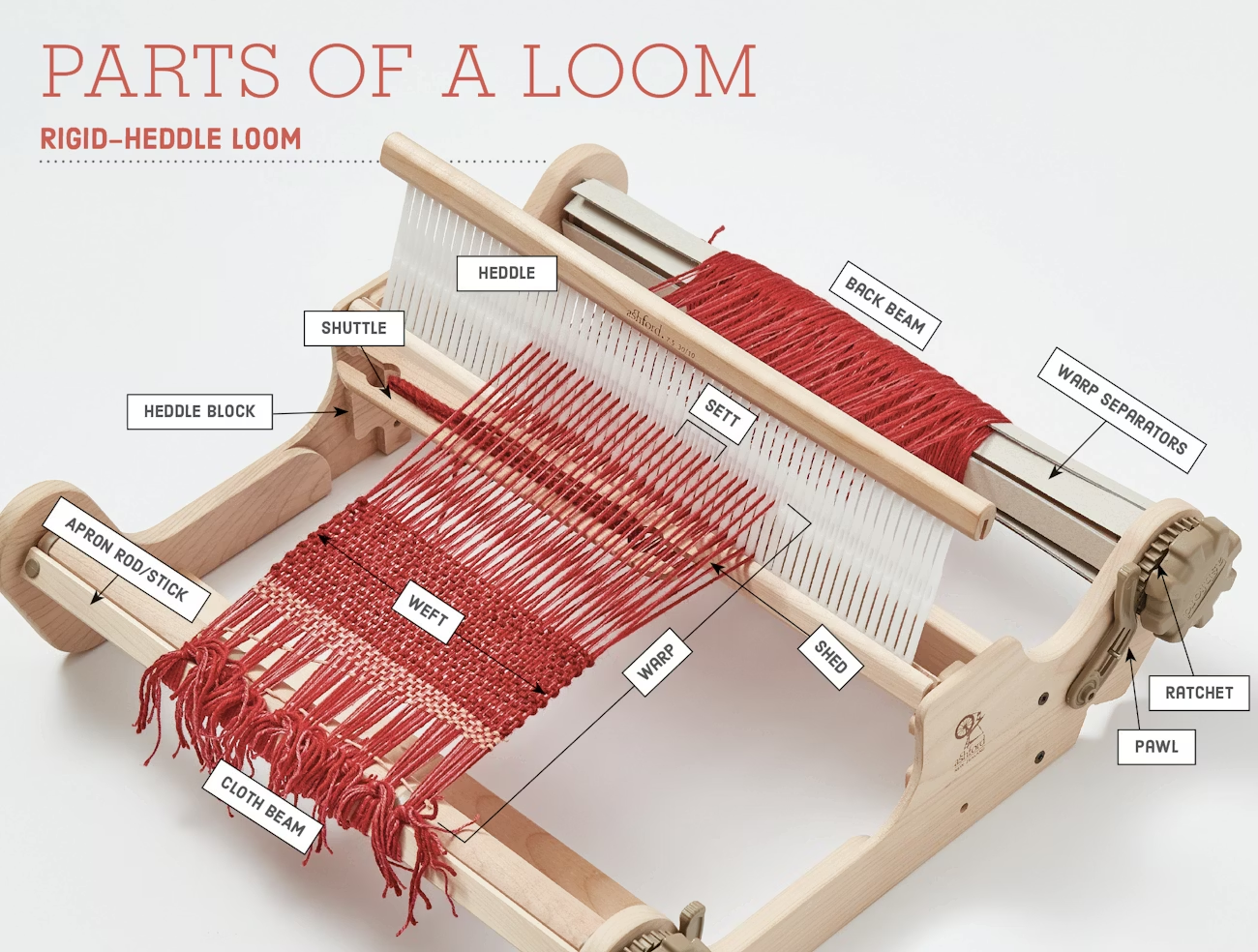
Parts of loom
Source: https://littlelooms.com
To get actual blocks, the weaver must program a flawless binary dance between the two systems. Where identical colors cross — you get a solid block! Where they intersect with a contrasting color, they blend into a soft, half-tone pixel. Once these technical rules of the grid were set, humanity did what it does best: it turned a manufacturing limitation into a powerful social code. If you view checks as just a casual textile choice, you miss the bigger picture. The pattern quickly turned into a visual passport, telling the world exactly who you were, where you came from, and how much power you held.
Part A. Smart-Casual Staples (Plain Weaving)
Now that we have the theory down, let’s talk about the shirts hanging in your summer wardrobe. This first group belongs to the dead-simple world of plain weave — think a strict, rhythmic “one thread over, one thread under” pattern. There are no complex structural tricks here; it is all about lightweight, ultra-breathable fabrics mixed with sharp, high-contrast graphics.
1. Gingham
Visual Formula: A perfectly balanced, two-tone grid of equal-sized squares. It features a solid color (usually red, blue, or black) crossing a white background, creating intermediate, half-tone squares where the colored threads intersect.
The physics of Gingham is the easiest way to see the loom’s logic. To create it, the mill maps out the warp with 10 colored threads, followed by 10 white threads. If you run only a white weft through the shuttle, you end up with basic vertical stripes. To get actual blocks, the weaver must alternate the shuttle: 10 passes of colored yarn, then 10 passes of white. Where identical colors cross—boom—you get a solid block. Where they meet white, they blend into a soft, half-tone pixel.
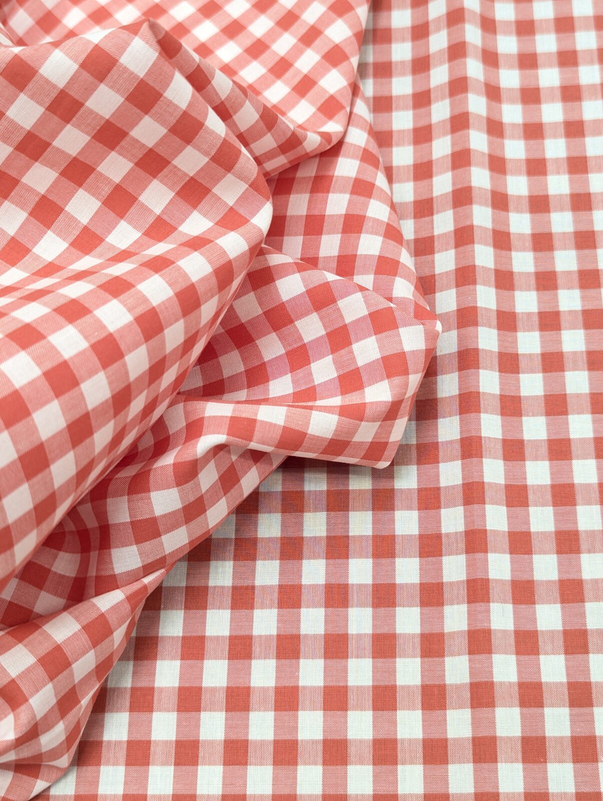
The name originally stems from the Malayan word ginggang (striped). Because it was cheap and washed easily, it became the global uniform of domestic life, military bedding, and school uniforms. But then came the paradox.
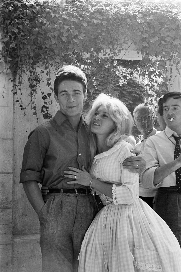
In 1939, Hollywood used a blue Gingham dress for Dorothy in The Wizard of Oz to project pure innocence. Exactly twenty years later, French sex-symbol Brigitte Bardot completely shattered that image. She got married in a pink-and-white Gingham gown, instantly turning a humble kitchen cotton into the ultimate symbol of Riviera high-fashion sexuality.

2. Madras
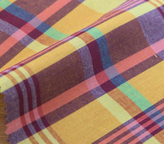
Visual Formula: A vibrant, asymmetrical grid featuring multi-colored strips of varying widths. It does not repeat uniformly, and its hand-dyed colors gently bleed and fade over time into soft, muted pastels.
But lightweight cotton and plain weave can travel far beyond domestic utility. As global trade expanded, the plain-weave grid left Europe and checked into completely different climates, taking on entirely new forms. This brings us to Madras.
Originating in the sun-baked coastal town of Madras, India, this cloth was dyed with local vegetable extracts like turmeric and indigo. Because the dyes weren’t chemically fixed, the fabric had a unique technical flaw: the colors bled in the wash. To local merchants, this was a defect. But to Brooks Brothers in the 1950s, it was a goldmine. They snapped up the fabric for Ivy League students and passed off the bleeding as a premium feature labeled “Guaranteed to Bleed”. Suddenly, a faded Madras shirt proved your family was wealthy enough to spend summers vacationing on New England beaches. A humble Indian utility cloth turned into the uniform of old American money.
Sourcing History: The Smelly Sign of Luxury
Original vintage Madras had a bizarre technical quirk: it smelled of sesame oil and lemon juice, used by Indian weavers to soften the raw cotton threads. In 1950s American country clubs, if your jacket gave off this faint aroma, it was foolproof proof that you were wearing authentic, hand-woven imported luxury.
3. Graph Check
Visual Formula: A crisp, minimalist grid composed of very thin, single-colored lines crossing at perfect intervals over a solid light background, mimicking coordinate graph paper.
If you scale the plain weave formula down to “1 colored thread against a wide block of white ones,” you leave the multi-colored drama behind and get Graph Check. It is the quiet intellectual of the shirting family, operating with mathematical precision.
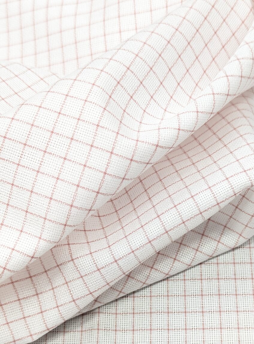
It came about as a solution for the strict corporate dress codes of the 20th century. When solid white shirts felt too sterile, and bold stripes felt too aggressive, Graph Check provided the perfect compromise. From a distance, it reads as a solid, textured color. Up close, it reveals a sharp geometric grid, signaling that the wearer values order and clean lines.
Part B. The Tailoring & Heritage Classics
This family leaves behind the lightweight utility of summer cottons. Powered by dense twill weaves and heavy wools, these patterns were designed to withstand the cold while acting as rigid social markers.
1. Windowpane
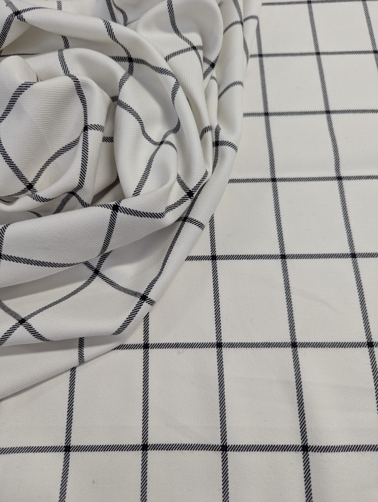
Visual Formula: A large, open, and perfectly square grid formed by thin, single-colored lines spaced widely apart on a contrasting background. The vast unpatterned spaces inside the “panes” create a striking architectural look.
If you want to understand how the grid functions as pure architecture, look no further than Windowpane. Unlike traditional heritage checks, it doesn’t try to blend colors or create intricate optical illusions; it values clean, geometric vacuum.
Windowpane didn’t inherit its codes from rural landscapes or military battles. It came about as a reflection of 20th-century urban modernism. Because the lines are so thin and the squares are so large, this pattern does something magical to a masculine silhouette: it creates a strong visual frame that broadens the shoulders and chest without adding physical bulk. In the mid-20th century, it was taken over by Hollywood directors and visionary Italian tailors to dress men who wanted to project effortless confidence. It remains the ultimate choice for the creative class—sharp, mathematical, and deeply sophisticated.
2. Tattersall
Visual Formula: A crisp, dual-colored grid crossing over a warm, cream or light-beige background. It always utilizes two distinct contrasting colors—such as dark green and navy, or burgundy and black—that intersect at regular intervals to form perfect, repeating squares.
While lightweight Madras was taking over American summer style, across the Atlantic, the British establishment was perfecting a completely different aesthetic for the cold seasons. They didn’t care about sun-bleached pastels; they wanted structure, durability, and a way to signal status on their country estates.
To achieve this, the British elite didn’t look to the sea, but to the racetrack.
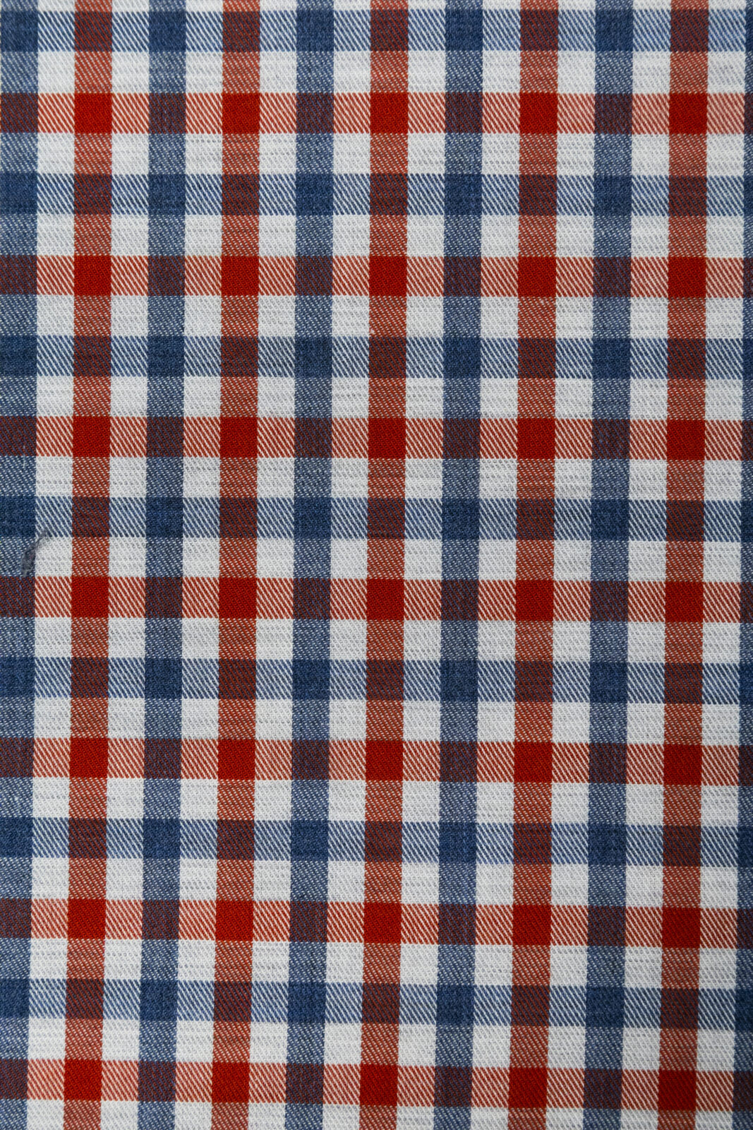
In 1766, Richard Tattersall established London’s first exclusive horse auction mart. To make his premium thoroughbreds instantly recognizable, he ordered distinctive wool blankets woven with a clean, dual-colored grid on a cream background to dress the horses. The pattern was an instant hit. The textile industry quickly branched out, moving the design from horse blankets straight into gentlemen’s shirting. For a country lord, wearing a Tattersall shirt under a heavy tweed jacket wasn’t just a casual wardrobe choice. It was a visual handshake, signaling that you belonged to the elite world of British equestrian clubs and hunting sports.
3. Tartan
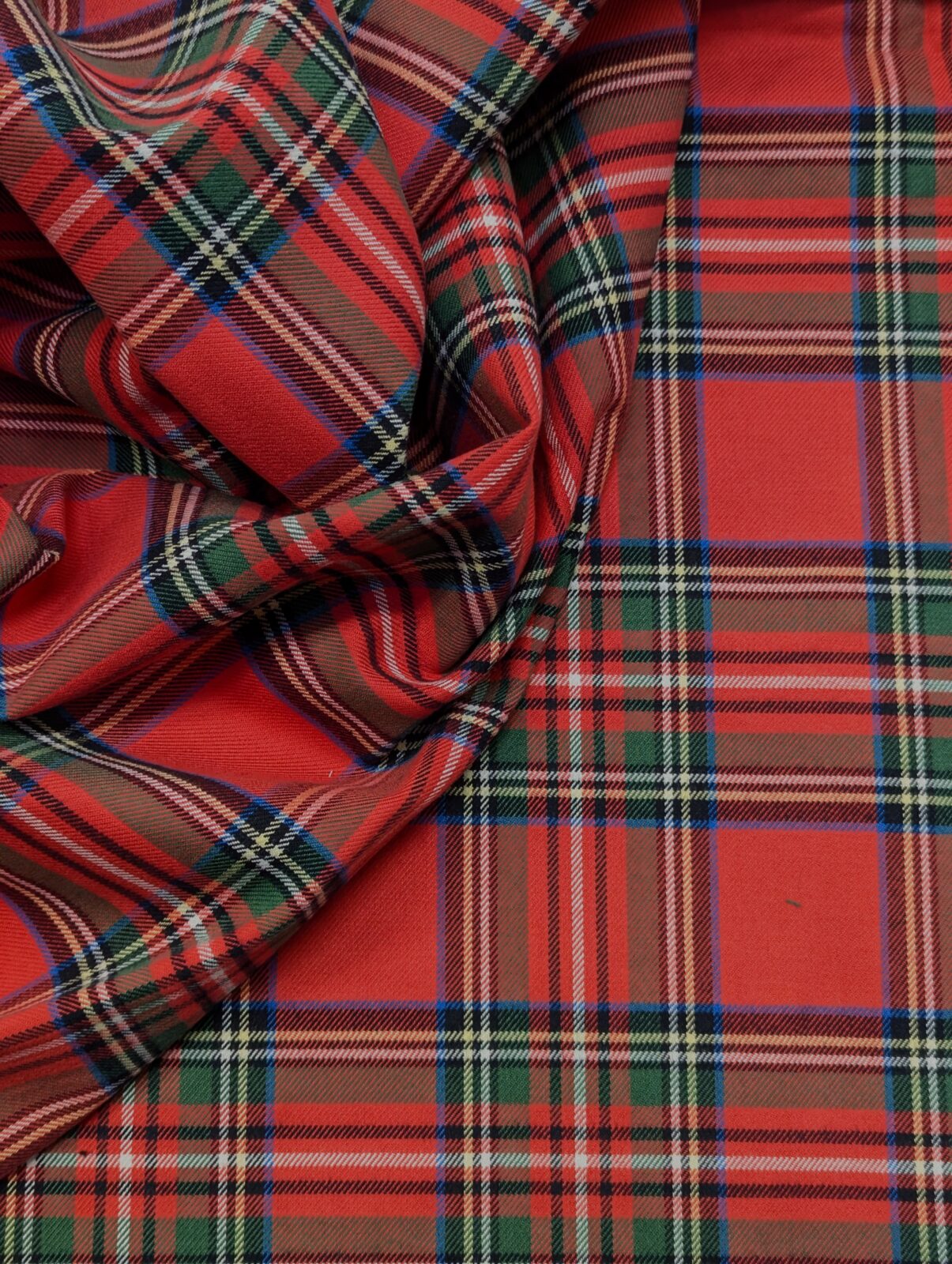
Visual Formula: A complex, multi-layered, and strictly symmetrical pattern (sett) of intersecting horizontal and vertical bands in multiple colors. Woven in heavy twill wool, the diagonal alignment of the threads creates rich, blended tones where different colors cross.
If Tattersall was the polished signature of the English aristocracy, Tartan is a story written in blood, terrain, and political defiance. It is the most heavy-duty, multi-layered wool tradition in the history of weaving.
Originally, Tartan wasn’t about high-fashion luxury—it was a product of local geography. Because early weavers relied on nearby plants, roots, and berries to dye their wool, a specific color palette naturally belonged to a specific valley or region. Over time, these hyper-local colorways turned into the official uniforms of the great Scottish clans. Walking into a room wearing your family’s exact pattern repeat was the ultimate declaration of identity, clan loyalty, and territorial pride.
The grid pattern became so deeply tied to Scottish independence that the British establishment viewed it as a literal weapon.
Sourcing History: The Dress Act of 1746
Following the Jacobite rising, the British government passed The Dress Act of 1746, making it completely illegal for Scottish men and boys to wear Tartan or kilts. The penalty? Six months in prison for the first offense, and seven years of banishment to overseas colonies for the second. Britain understood that to crush the rebellious Scottish spirit, they had to legally ban their fabric.
Part C. The Micro-Scales & Sophisticated Blocks
This group represents the pinnacle of textile geometry. By manipulating the scale of the grid and mixing multiple yarn colors, weavers moved away from bold, solid blocks to create sophisticated, shifting optical illusions.
1. Shepherd’s Check
Visual Formula: A small, uniform two-tone check pattern (typically black or dark brown on a white background) woven in a twill structure. It looks like Gingham, but the diagonal twill lines produce a distinct, slightly textured edge on the squares rather than flat, clean pixels.
Before kings and global brands claimed the luxury grid, there was Shepherd’s Check. It is the rustic ancestor of almost every sophisticated tailoring pattern we wear today.
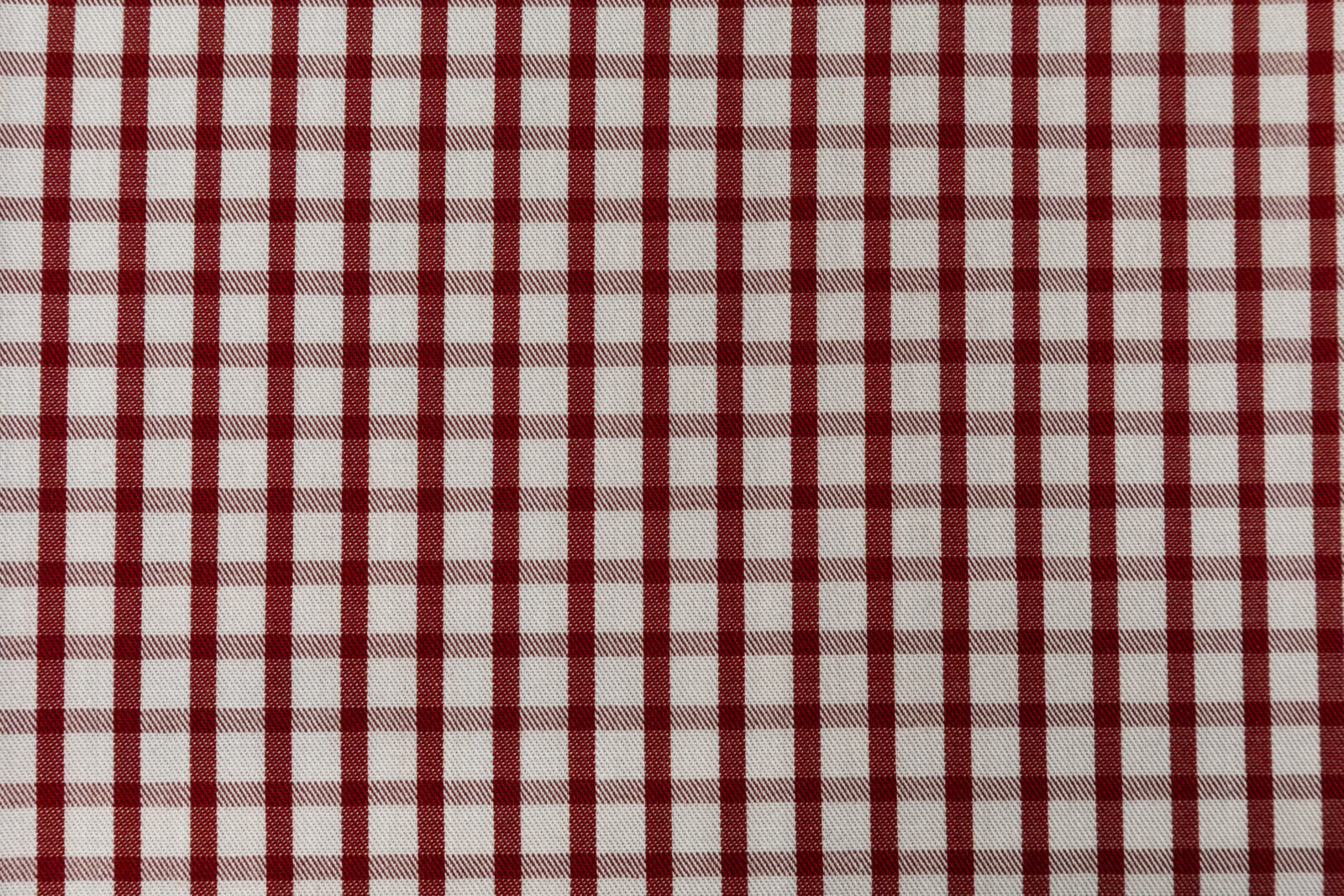
As the name suggests, this pattern brought up generations of sheep herders in the border country between Scotland and England. Woven from undyed, raw wool (using dark wool from black sheep and light wool from white ones), it was pure utility. The dense twill kept the shepherds warm in freezing rain, while the small black-and-white grid was brilliant at hiding dirt. It was a pattern born on the soil, completely detached from clan politics or military status. It was simple, honest, and functional—proving that the grid doesn’t need royal permission to look incredibly sharp.
2. Gun Club
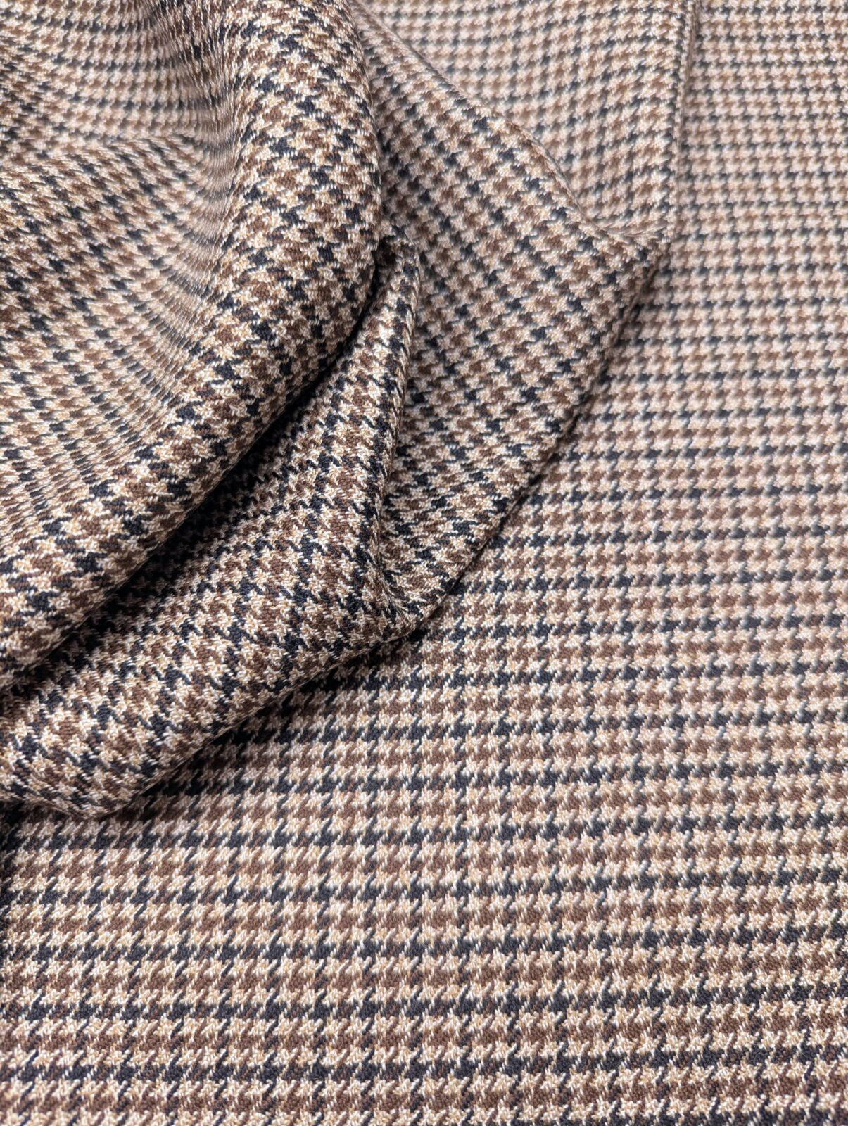
Visual Formula: A small-scale, multi-colored check pattern featuring alternating bands of at least three distinct colors (traditionally black, rust-brown, and forest green) intersecting over a neutral light background, creating a rich, multi-toned landscape.
If you take Shepherd’s Check and introduce a third color into the warp and weft sequence, the pattern undergoes a dramatic evolution and turns into the Gun Club.
The pattern originally belonged to the Scottish Coigach district, but its global luxury status was sealed in 1874. That year, the American Gun Club—an elite shooting sports association—adopted this multi-colored micro-check as their official club uniform. The genius of the Gun Club pattern lies in its versatility. Because it blends tones like olive, brown, and gold, it acts as a textile chameleon. It mimics the shifting colors of the autumn landscape, making it the perfect smart-casual choice for country jackets that need to look relaxed yet unmistakably expensive.
3. Glen Check & Prince of Wales
Visual Formula: A highly complex master-grid composed of alternating large blocks of tiny houndstooth checks and microscopic pin checks. A true Prince of Wales version overlays this black-and-white base with a prominent, large-scale windowpane window in a contrasting accent color (like rust or sky blue).
We finish our journey at the absolute pinnacle of luxury suiting: Glen Check. This is where technical weaving limitations were completely conquered to create the ultimate symbol of royal rebellion.
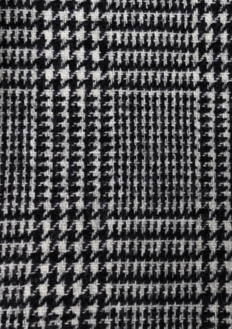
The design originally came about in the valley of Glenurquhart, Scotland, where local workers who lacked a formal clan tartan used it as a house uniform. But in the 19th century, King Edward VII (then the Prince of Wales) came to the valley for a hunting trip, fell in love with the understated, matte geometry, and ordered suits made from it.
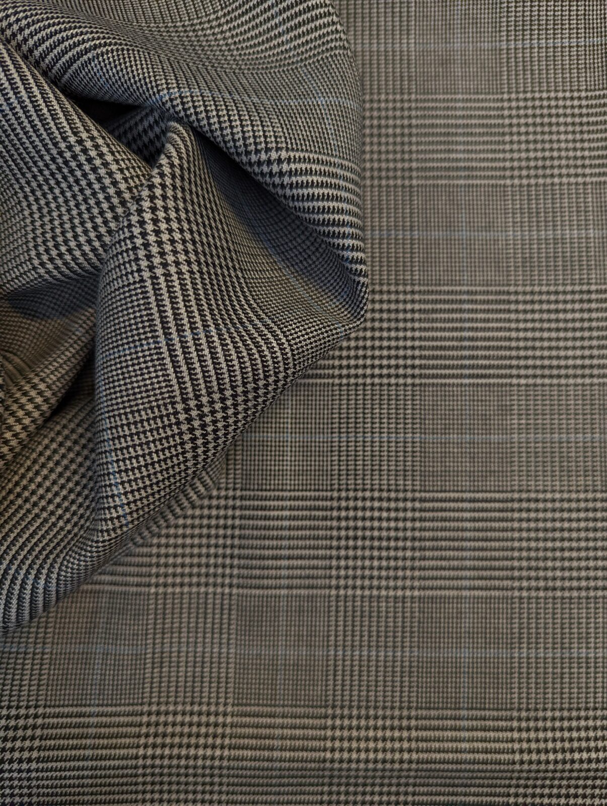
His grandson, the Duke of Windsor (Edward VIII), took the pattern even further. Known for his rule-breaking style, he brought this casual country check into the formal, high-stakes rooms of London and New York. By adding a bold, contrasting overcheck, he made Prince of Wales the definitive uniform of the global elite. From a distance, a Prince of Wales suit looks like a soft, textured grey. Up close, it reveals an incredible mathematical layout of broken twill. It is the ultimate statement of quiet luxury: complex, intelligent, and deeply historic.
Conclusion: Writing in Threads
When we look back at the history of the grid, a clear lesson emerges. The check pattern was never a choice made by artists playing with colors on a blank surface. It was a code hammered out by the physical limits of the loom, the scarcity of local dyes, and the strict rules of thread counts.
Yet, humanity took this mechanical cage and turned it into a living language. We used it to identify clans in the misty hills of Scotland, to signal wealth on American beaches, and to project architectural confidence in modern cities.
For anyone working in today’s clothing and textile industry, the grid is a reminder of a foundational truth: great design doesn’t require infinite options. True timeless luxury stems from understanding your technical constraints, mastering your raw materials, and finding the wild, human poetry hidden inside the mathematics of the loom.
The floors of the Temple of Augustus in Cartagena, Spain
Source: https://murciatoday.com/